


The Typocondriac Newsletter S01E01


Hi everyone,
Here we go for the first issue of my newsletter. I am really excited to share with you many ideas, links and inspiration I have been saving lately. You may have seen some of them already but I am sure you are going to learn something interesting that could possibly create an idea for a new project or concept! And I wanted to send it on a friday afternoon so you can enjoy it during the weekend ;-)
Personal news
I have launched my website in november on Squarespace and I am totally happy with it. Totally less work than with WordPress. I still have some tweaks to do and I have to work a bit on SEO but overall I am really happy. As a former WordPress dev, that was a big step to move to something else. But I needed a simple solution, hosted, without having to install updates, for software but also plugins, having a nice shopping solution and many other features... And Squarespace does the job really well!

In november I also released Farandole, my first color font, created with Fontself. I have also put it for sale on Creative Market. But to be honest, I still don’t know what is the best solution for me. If you have experience with selling fonts, let me know. Right now, I am working on 5 different other fonts. Some will be released soon, some may take years! But with some time, maybe I will know better where to sell and also how much to sell. I find it really difficult to get a good and interesting price when I look at the market and so many differences. Especially the really low prices of Creative Market. I think my work deserves respect and I did put a lot of work into it. I just can’t sell it for $10...
On other news, I planned to create few blogposts regularly. I did not have time to create one yet but I have two under go, and two about books. The first one is about « Type and color », a book about creating color fonts. Fantastic book. And the other one might be a kind of bible of Type Design, it is « Theory of Type Design ». I hope both of them will be released next month so you have more to read from me ;-)
Now, let me share with you some nice stuff I’ve found out lately in the Letters world!
*Typography Annual 10 Commarts* I have been a huge fan of the Typography annual of Commarts since I am in the lettering world. Each year, they publish a great magazine, with the best lettering and type designs you can get. Really fantastic source of inspiration. For me that is one of the best, really.

*Typographica’s Favourite typefaces of 2018* I am sure you have already seen this one but just in case, go check out these great typefaces chosen here. Some are really really impressive. I am more of a display fonts guy but that list features also some fantastic text fonts. This year, I am particularly impressed by Salvaje, Ohno Blazeface or CoFo Chimera in the selection. More or less display, they can be used for longer texts I think.

*Riley Font* Talking about fonts, Fenotype released a great upright script font lately, available on MyFonts.
*Buddies* In the same style, Guille Vizzari released Buddies at SudTipos. As always, I am really fan of Sudtipos releases and also how they choose great designers to work with them.

*Banjo-Kazooie Vinyl Soundtrack* For those who follow me on Instagram, you know how much I love design stuff from the 40s up to the 70s and especially coming from the US. I discovered some weeks ago that fantastic project that brings back the Banjo-Kazooie soundrack on vinyl with a fantastic artwork. Great inspiration! Go check it out!
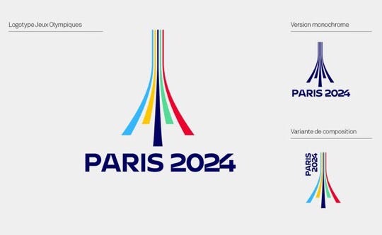
*Paris 2024, my logo is better than yours* Typeroom published lately a blogpost about the controversy that happened around the new logo for olympics games in Paris in 2024. And Graphéine, a french design agency who applied for the whole identity was a bit upset seeing what had been chosen. And some of the twittos designers too.

*DSType The complete library* I am a big fan of DSType work. Over the years, they released fantastic fonts, whether display or text ones. So when they announced they were publishing a book about their fonts, I did ordered it immediately. I received the book before Christmas and it is fantastic. I love it. It is always nice to check for inspiration online but taking the time to open a book, while being on an armchair is not comparable. So get that book and find you a nice place to read it ;-)
*Proof it!* by James Edmondson, is about taking the time to put your typeface into situation in order to present your work or just to test it, see what works and what does not. He gives great insights on how to do it. Really useful for every people who wants to show the real esthetics and legibility of their font.
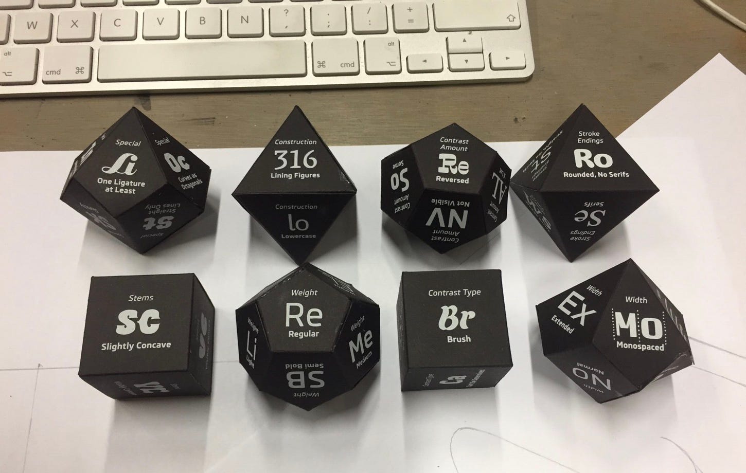
*Typecooker* If you want to play with letters but don’t really know what to do, just check the typecooker which is going to help you choose styles so you can create some letters or a lettering based on the styles it gives you. You also have different levels ;-) I personnally love it! And I would also love to get these dice if someday they get out!
*The Scriptmas calendar*To finish that first issue of the Typocondriac newsletter, I would like to share with you some nice stuff I found on Instagram lately. I must admit it became really difficult to find new stuff with all the noise on the platform but this month, I would like to introduce you to a fantastic letterer, Jonathan Ball. And if I talk about him, this is because he made in december a great advent calendar, called « Scriptmas ».
That is all for today :-) I hope you did discover some nice stuff here. If you have ideas about things you would like to see, don’t hesitate to reply to that email to let me know. I am always open to new ideas!
And if you like, don't hesitate to spread the word and share it!! <3
Have a nice january and see you around ;-)
Francis