


It's never easy to create a font...


It's never easy to create a font - Typocondriac Newsletter n°6
Hello my friends,
This month I am a bit late to send my newsletter. But I have a good reason for that! Every month I say that the next month I will share a new font with you. And every month, I have nothing to show because it takes so much time to release a font!!
So, this month I said I would do my best to finish my update of Farandole before I can send the newsletter, which is usually at the end of each month. So yes, I am a bit late, but I have good news. Farandole V2 is out!!
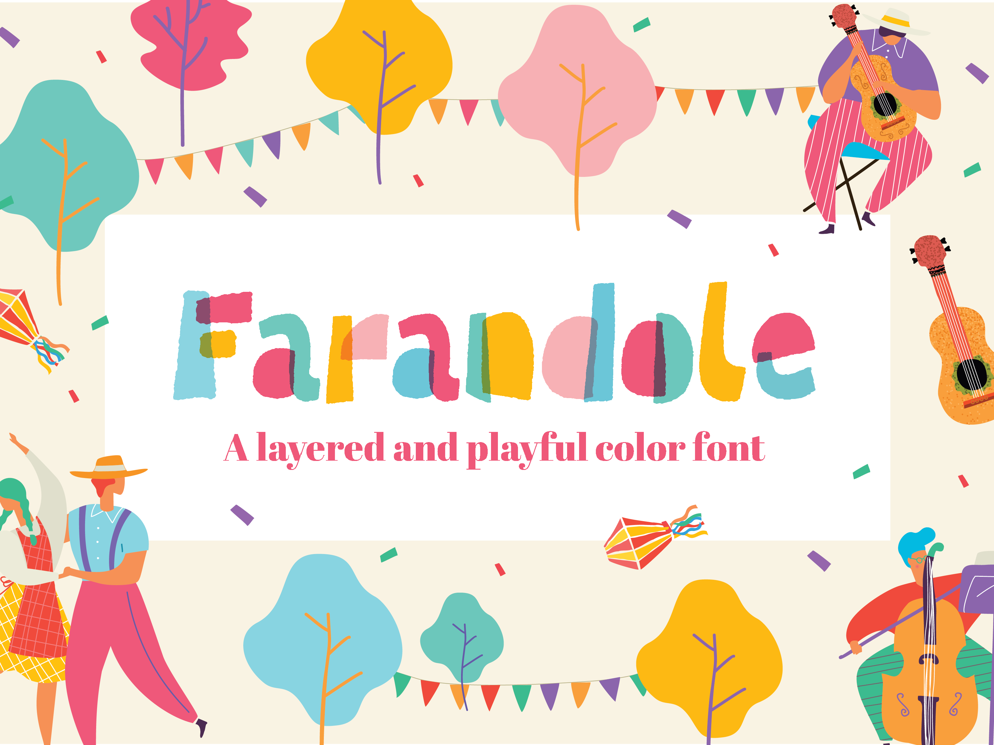
So what is new in Farandole V2. I totally re-developed the font in Glyphs. I love Fontself, in which I created V1 but when it comes to modify colors, it can be tricky. And some customers asked to be able to change them. So I had to redevelop it in layers. It means that each part of a letter has its own layer so that you can change the colors the way you want. At the end, if an « a » has 3 parts or components, it has 3 layers. And then 3 colors.
It may sounds complicated and many people don’t know about layered font, so I created short videos to explain:
https://www.youtube.com/playlist?list=PL8UNjlfKqU-TvWVa6hHcnA_855GO5c9SW
That was a long long work because I never created a layered font before and I missed some points at the beginning. Thanks to community, friends and Glyphs support, I could make it easier.
So now I am happy it is finally released. But it can takes so much time to create a font. Sketching and vectorizing is a lot of fun but spacing and kerning can be boring and long, you have to create visuals for your font, sometimes videos to explain how to use it, you also have to create a nice Readme file to explain these details « on paper ». Yes, it is a lot of work, and it is hard to keep the motivation. Especially when you are working on another font that is also complicated to do, which is my case. The two first font I decided to release are a layered color font and one that has many Opentype features (ligatures, alternates, conditional characters, etc).
I started Farandole early last year, it was released in november, so around 10 months after I started it. In january 2020, I decided to redevelop it from the beginning. In another software. And it is ready now. For my second font, which is now ready and will be released very soon ^^, I had the idea to integrate many ligatures. At the end, I have nearly 1000 glyphs and many conditional uses. So I did not make it easy for my 2 first public releases :D
Something I have learned from that first experience is that it is important to mix big and small projects to keep the fun and the motivation. And in the future, I will work on complex fonts for sure, I love that, but I will also work on small and fun fonts which can be released quickly. Having both kind of projects is important to keep the passion and bring the money at home.
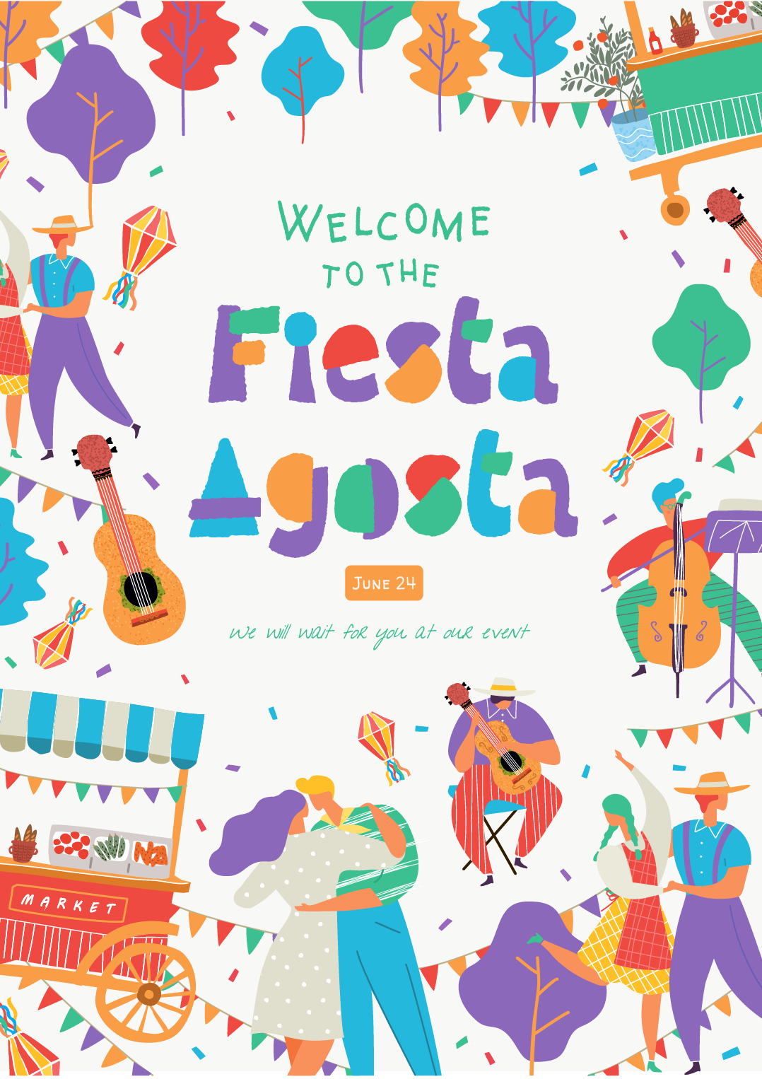
So if you are interested in Farandole, I made a huge discount for its launch, so right now it is 19CHF, so around $19 or 17€. Check these examples of uses you can make with it.


Inspiration and News for June
Ok, so now let’s see what I bookmarked in June and found worth sharing in this newsletter’s issue:
Underware Logotypes
The foundry Underware created a page with many of their logotypes works and some are really inspiring.
Alice Savoie interview
Alice is a great french type designer who created lately Faune, and got here interviewed to know more about her work. I must say I love FredFredBurger. If you are interested in letters and also in the place of women in the type industry, go check her interview.
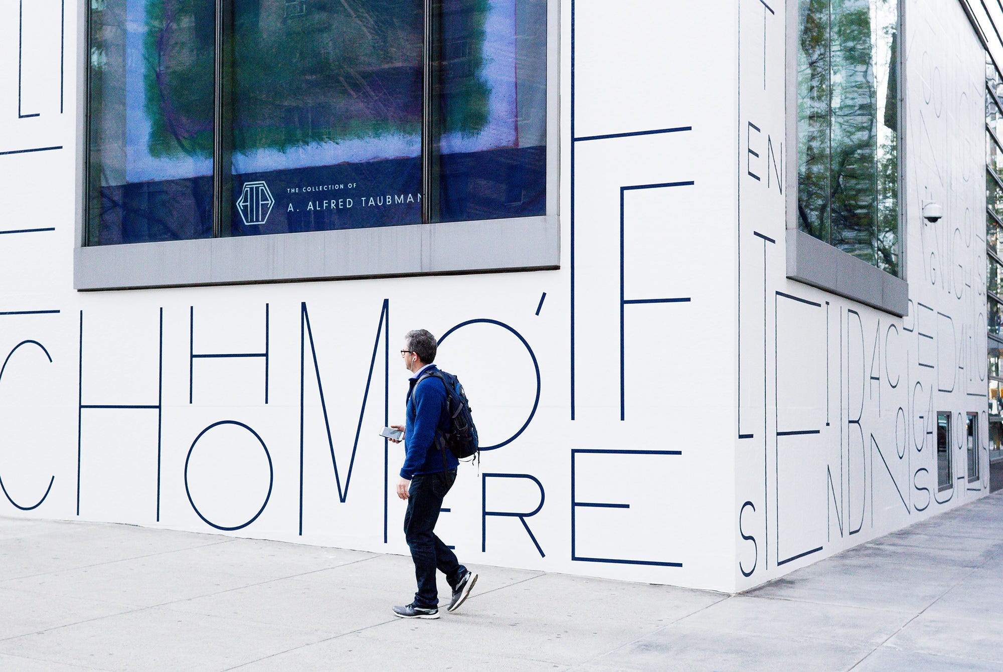
Sotheby’s Facade mural
I am not sure who did this mural, I could not find it, so, if you have the information, let me know. But the result is really stunning, design and minimalist. I want to see more of these.

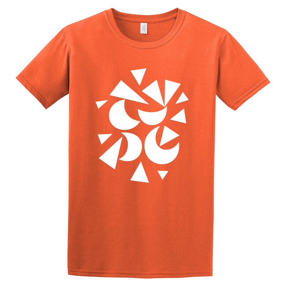
Typographics Tshirts
Who doesn’t like nice lettering or type t-shirts? This year, Typographics decided to create a line of t-shirts with some of the best lettering artists and type designers out there : Gen Ramirez, James Edmonston or Ken Barber. I particularly love the Type orange one done with Minerale font :-)
Fellow Creatures branding
Fellow Creatures is a vegan chocolate brand which decided to create a strong identity with a colorful palette and great letters. Don’t hesitate to contact me if you have such a project in our hands ;-)

Enorme Font
DST foundry just released its new font, Enorme. And I really like it. It can be really fun using it!! :-)

Cyla Costa for Fafa
We really need more logo like this one, it gives so much positive vibes! It may sound weird to say that, but I really believe letters can make the world a better place ;-) (sorry for the quality of the thumbnail)

Erik Marinovitch for M&Ms
Dream project :-)

Lettering from Steph Lopes
I really like that work from Steph Lopes. It mix really well letters and illustration. Perfect combo.

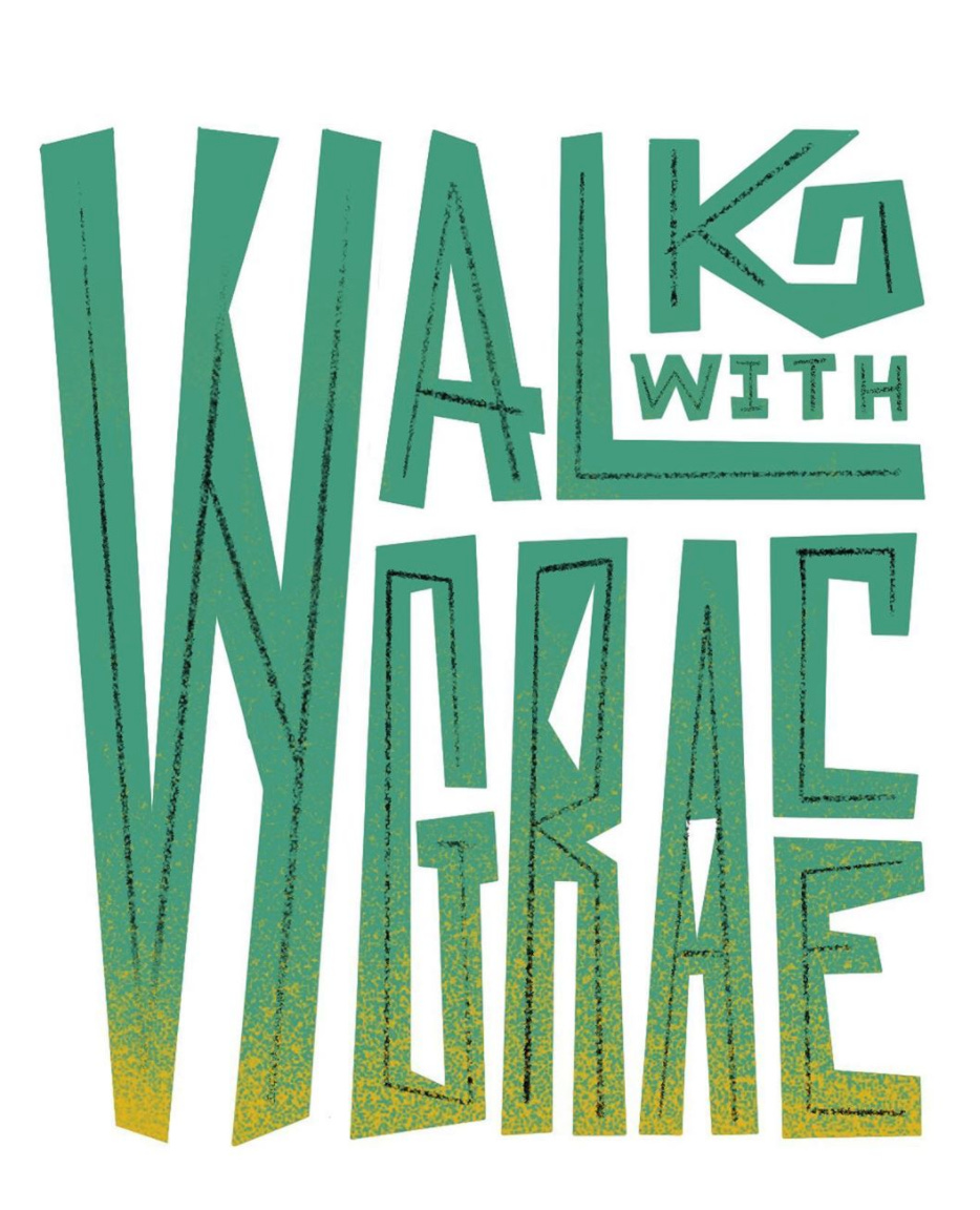
Walk with Grace by Hust Wilson
I did not talk about everything happening around us lately in this issue of the newsletter but I feel really impacted by the situation. Black Lives Matter.
And that's all folks! At least for this month :-) I hope you discovered some nice things in this newsletter, don't hesitate to give me your feedback ;-)
Talk to you next month!
Francis