The Typocondriac Newsletter 07 - Fresh New Ideas

The Typocondriac Newsletter n°7 - Fresh new ideas
Hello my friends,
Note: This is a long one, sorry for that, but I really think it is worth it ^^ and could talk to some of you :-)
It has been a few months since you had news from me. I took a kind of break during the summer. I took a break from that newsletter, but also from my work and the lettering environment. Actually, in June I realized my passion was not there anymore. I think I was overdosed for a long time but could not stop feeding myself with new inspiration coming mostly from Instagram. And what happened is that I did not like my job anymore.
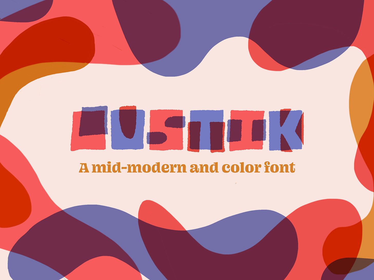
So I decided to take a break. But coming back to reality early september, I realized my passion was not back. Fortunately I was still having fun designing fonts, so I spent some time creating a new one, called Lustik.

Lustik has been a real joy to make and to play with. I really like playing with shapes and colors. And when I think of that kind of lettering depression I had lately, I know it has to do with the way I approach my work. I have more and more interest for illustration, and making fun and colored font has for sure to do with that growing interest. Also, on the other side, I really feel like when I only design letters, there is something missing. Like emotions for example. And that is why I think like bringing some illustration to my work, to express more feelings and emotions could be a nice move.
Reinventing my work
During that summer, I spent a lot of time thinking about it and I came across Andy J.Pizza podcast, book and courses. And I spent some time listening to and reading his wise comments on how to live your career. Reading his book, I found out what I explain above, that my work could move to something more fun, with colors and illustration. It concerns lettering but also type design. Like leave technique and perfection behind to try to express myself more. Andy's advice was really worth it. If you are not sure where to go with your creative life, check out his podcast/book/Skillshare courses.

I also read Lisa Congdon's book during the summer. What a great artist and writer! In her book, "Find your artistic voice", I pushed a little bit further my thoughts. I know I want to be more expressive, but how could I do that? And that is where my "voice" comes into action. Lisa says that having a style can be important, but more important is to have a voice. Something that is YOU. Andy talked about it too when he helps you finding your style on his Skillshare class. But having a style that reflects who you are and expressing your ideas is quite different. Actually it is complementary but having your voice gets further.

More Outdoor and Nature
The more I was reading Lisa's book, the more I was realizing I needed to join my 2 biggest passions : Letters and Nature. I am a big fan of outdoors sports, like hiking, biking and trail running. And the more I am getting older, the more I need it in my life. Especially in these difficult times.
I am also more and more concerned by Climate Change. I am a member of local organizations but also bigger like The Sierra Club. I try to consume in a better way and buy clothes that try to protect better the environment but also people.
So I said to myself I should express the feelings and emotions I have regarding these subjects through my art and make it my voice. That voice Lisa talks about in her book. It also brings a great meaning to what I do.
Going further with who I am
So in the coming months, I am going to try to go in that direction. I say try because nothing is easy and we all have our demons telling us to go in another direction like "stay with what gives you likes and followers!!". But I feel like I need to spend more time with myself and less with my followers. I mean, I do love my community, but I really need to be more with me, expressing myself, even if it hurts some people. And I think we should all do the same and forget this race to depression. Having my voice and expressing it can't go anywhere if I am not spending some time with my feelings and emotions.
I also decided to stick with my voice in my clients projects too. From now I will do a kind of selection of people I want to work with and others I think it would not be a good idea regarding to my convictions. I hope having a voice will help me attract more nature oriented projects.
So stay tuned. You may see some new stuff coming, sooner or later, and I will always appreciate your feedback. Also Thanks for reading that really personal newsletter. It means a lot to me to be able to share my path with you.
Now, enough of personal stuff, let's get some fresh news!
Inspiration and News for September 2020
Here is what I bookmarked during the summer and also in september. As I was not checking much stuff in July and August, most links are from September and many things about Type Design. Hope you like them!
How to domesticate a wild typeface
Design Studio Typozon made a presentation last week about its typeface Salvaje. Check it out, they are talking about birds and nature which totally relate with what I said above no? :P

Timothy Goodman hits the Court
If you don't know Timothy Goodman, check out this work he did recently. This is a perfect mix of illustrative stuff and letters. Also his letters may not be "perfect" technically, they have strong personality.

Font Li Beirut
When explosion happened in Beirut 2 months ago, the type design industry found a good idea to help people who suffered from that event and lost everything : create a font with 150 letters coming from 150 different type designers. These letters are so beautiful and made for a great cause.

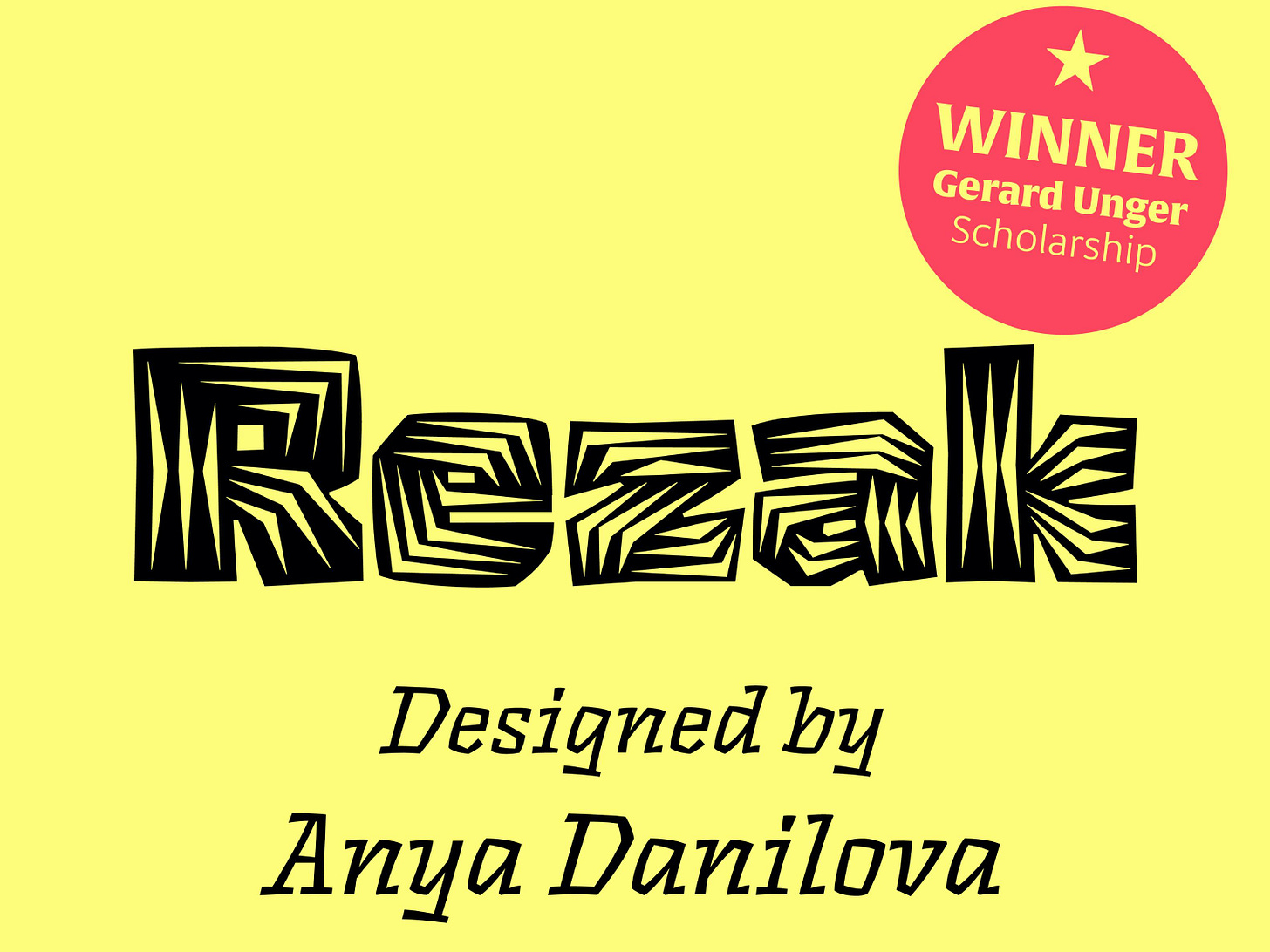
Rezak font wins the Gerard Unger Scholarship
Rezak from Anya Danilova, who studied at KAKB in The Hague, won the 2020 Gerard Unger Scholarship. I must say I really like that font because it reminds me the time I was doing linocut. Its lines, cuts are really fantastic in any style and I really want to see more of rough typefaces in the body text type industry.

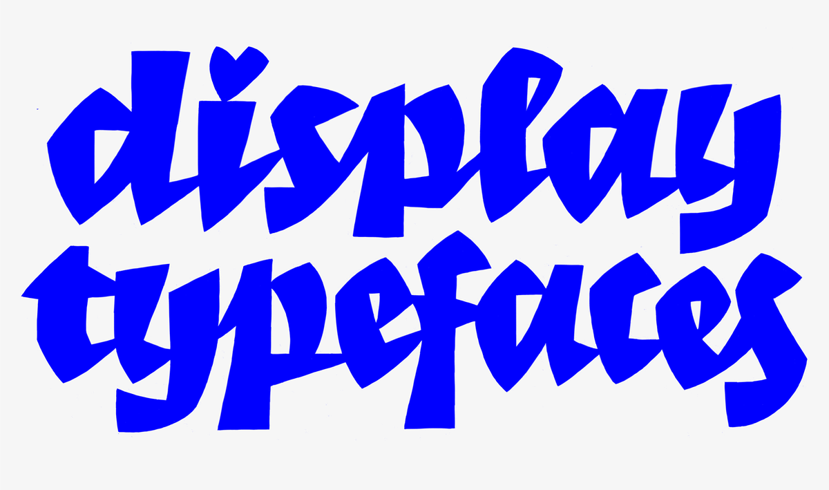
More Display Fonts please!
In her post, Maria Doreuli tries to show the importance of creating Display Typefaces today, the impact they can have on the industry in general and how they could change it too. Today, many many type designers judge negatively display typefaces like they are easy to do, but these fonts can bring so much and have an influence on how we create body text typefaces. A really good read!

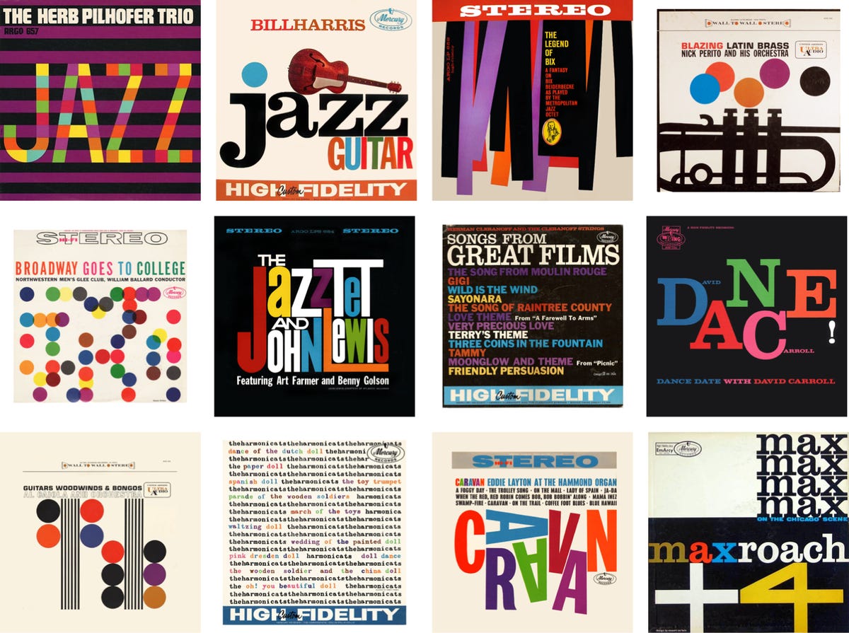
Inspired Design Decisions: Emmett McBain
This blogpost comes from Smashing Magazine, a well known web design and dev ressource. And in this article, from Andy Clarke, one of my heroes when I started web design in 2005, he talks about a great designer we don't hear enough around: Emmett McBain. His work really influenced advertising and illustration world in the 50s to 70s. He did more than 70 album covers. This article is really interesting for people like me who like relating their work to the Graphic Design history.

That is all for today. Thanks for reading it. I hope you enjoyed it as much as I enjoyed writing it. Sorry if my english is not perfect and can be confusing sometimes :P Don't hesitate to share with me your thoughts on what I said or shared here. I will reply to each of you :-)
Talk to you next month!
Francis


