


Say hi to Scusi, my new font!
I am so excited to show you Scusi and tell you more about it!

Hello everyone,
I hope you had a great week. Here I am trying to get organize so every friday I have something interesting for you :) And this friday, I am happy to share with you my new font, Scusi!

Scusi is born from my love for 60s, 70s Italian movie posters, especially the ones from Sandro Symeoni.


It has everything I love: style, identity and a sign of imperfection. Yes, I think I am more and more in love with imperfection. And making that font was exactly everything, except a long and complicated type design project. It was only fun!
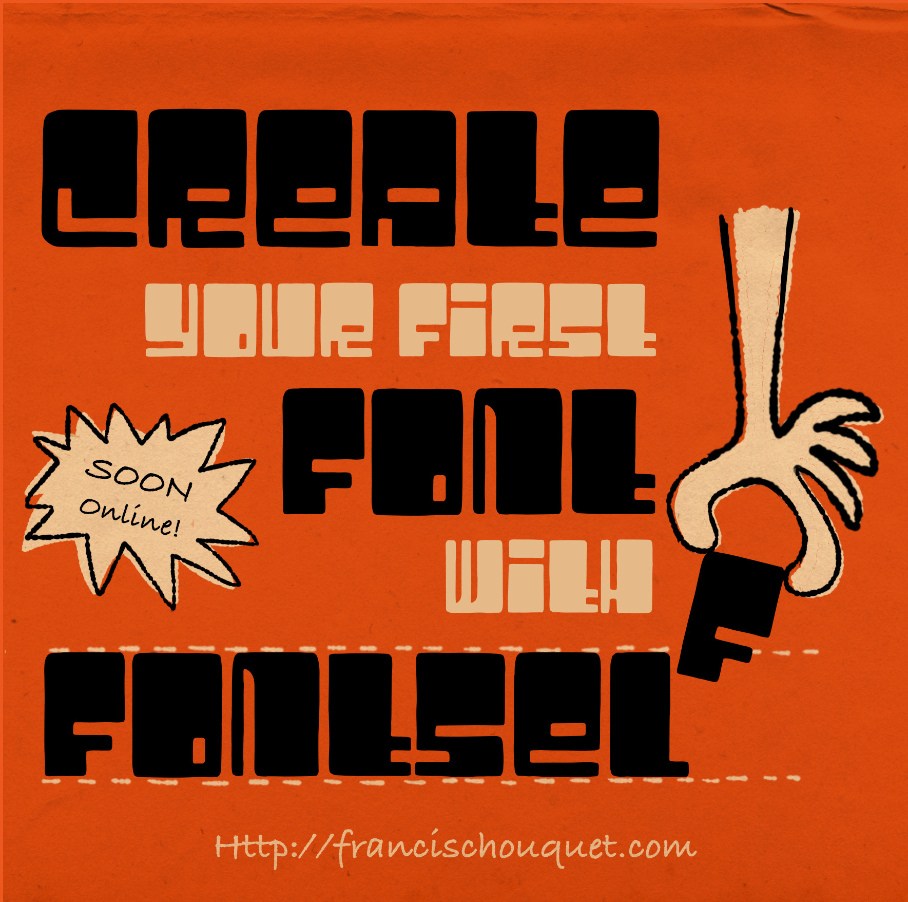
Made with Fontself with love
This font was 99% made on the iPad. Yes. I drew them with my Apple Pencil, on the Fontself app. It did all the spacing magic (or nightmare?) for me. I had to rework a few glyphs on the computer though, and add font infos, but yes you can do fonts on your iPad.
I will write a full detailed blog post on how I did create the font, and how I did work on Fontself soon. I will let you know.
I love imperfection
Coming back to my first inspiration, Symeoni’s work, I based my alphabet on something similar to the A you can see above on posters. But I changed it. And I used the whole shape to do the rest of the letters in the same way Symeoni did his A. This way I got away from something too similar to his style. And find my own. It is more geometric but still imperfect. And I love it. Everything I see everywhere that is not perfect is great to me. It is full of emotions. I like technique, but sometimes it kills expression and identity. And Symeoni’s letters, a bit like did Saul Bass, are sketched, hand made. There are no straight lines or perfect Beziers curves here!
Imperfection to me brings more creativity, more freedom. And I think my fonts have something of that. I mean I hope so.
So here is Scusi, an italian name for an italian inspiration.
Here are some visuals I made for it, and I even used the devil MidJourney to create 2 illustrations to see if it would fit my font. I think it does, no?

Scusi is already available from my website for 19CHF, which is around the same in euros or dollars.
To my paid subscribers
First, I would like to thank you for your support, it motivates even more to produce more content. The first paid post will be published next tuesday. I have already 10 fonts in the making for the next release. It is not easy to know which one to work on first. On one side, I want to keep the fun going on, but on the same time, I would like to make a bit more money out of my fonts now that I work 100% on passive income. So I might work on one or two more serious fonts (but not too serious too…) in the coming months.
I will share with you my perspectiveon that subject as part of the subscription is for you to come along and follow me on my journey into font design. Next week, you will also get a font I am working on to play with on your personal projects and let me know what you think.
For those who would be interested to subscribe and join the group, here is the link to my different subscriptions. Let me know if you have any questions :-)
Time for some inspiration!
Ok, I am sure you are looking for some inspiration now, right? So let’s go!
I had the chance to be interviewed by Dani Molyneux who manage her own studio in Manchester, Dotto. She contacted me last year to do an interview about my work, but also how I approach it. We talked about my love for letters, nature, Basel and architecture. Really fun do it, go check it out!

I came along that great project from Tamara Arkatova and I could not resist saying “Yeah!! See we can do great project with fun type!”. It gives the product life, energy, emotions. I mean type does not always have to be serious and Helvetica-like. We need more fun and funky type!


Something to read now :-) I have suffered in the past by that tendency to be always productive, fully effective. Especially in client work, where projects needed to be delivered faster, for cheaper budgets and half of the time without listening to me as an expert in what I do. I felt a lot exhaustion actually. And I have always felt like creativity is not something you can do all day long, all week along. Also, working 10 hours straight does not mean you are going to be more productive or more creative. It is actually the opposite. So I was really happy when I discovered that report from It’s Nice That.
I think I will do a full post on that subject but go and read the whole study. I am sure many of you will find some relief knowing that it is ok to not be productive 8 hours a day :)

I am totally in love with that project from Tad Carpenter. I mean, global design is great, illustration is great, type is great and color palettes are great. I will insist saying that type here again has something fun, so now you know me, that is what I like!! :) Go check the whole project, this is brilliant!

You may have not seen the work I published this week on social medias. So here it is. I did make a few colorful lettering pieces. They are really important to me because I feel like this is my identity right now and I may want to concentrate my lettering work on that style. First is “Do it your way” as a reminder of last week post. And the other publications are tests I did for my next screenprinting project, so next prints on sale too. What do you think?


That is all for this week! See you on tuesday if you are a paid subscriber (link above if you want to join :) and if not, see you next friday with probably a global subject about communication and social medias :-)
Take care and enjoy the weekend,
Francis