


#13 - The shop is open!
Why not get a print for Christmas?

Hello everyone,
November has been a really busy month for me between travelling around France for doing some training, finish a font and setup my online shop. But I am pretty proud because I could do all of it… Except that I did not have time to create visuals for my new font. So it will be online later this month and available for the next newsletter :-)
The shop is open!
So let’s start with the shop! Yes, it is now open and ready for you. You can find there my 4 different fonts and 5 illustrations. These illustrations are a part of myself I have been wanting to explore for some time now. Create illustration, print it and sell it.


Few months ago, I decided to invest in different printing techniques. With my collective, we bought a Risograph but we don’t have yet enough drums and colors to do something good and these materials are hard to find and ridiculously expensive. On my side, I did invest in a A3+ giclée printer, a Canon ImageProGraf Pro-300 and everything to do some screenprinting. I actually did setup a whole room in my basement to screenprint.
For the launch of my shop, I focused on giclée prints. Giclée is a classic way of printing with ink but these ones are high quality real pigments inks. Which means they last longer and colors are more powerful.
I chose 5 illustrations I wanted to sell and started doing tests. These were really great and I am so impressed by the colors.
I did setup my shop with Woocommerce and created different visuals using mockups for each illustration. Classic stuff when you sell that kind of products. It took me something like 2 weeks to set everything up and be able to share the news on monday.
I must say I am so happy with the outcome. I love my illustrations, I like the visuals and even if it is quite simple, I am also really happy with the design of the shop and website in general.
So here are a visual for each illustration.


And because you are the most important people to me, I am happy to give you a 20% discount on the whole shop. But not only for today or one purchase. No. Newsletter subscribers get 20% off all year long and on every product, fonts included of course. So anytime you want to buy something from me you like, just remember to use your coupon code. So here is the code: SUBSCRIBER20.
What’s next?
Next step is going to release my new font and start creating some illustrations but this time using screenprinting technique. I have already 2 projects in mind. So looking forward to work on them as screenprinting is a real manual way of printing, with real ink, smells, dirty hands, and you really feel good after a long day making many tests!
I will let you know next month where I am with this technique but as Christmas is coming fast, the next weeks will surely be slower.
So have a look at the shop, prints or fonts and if you find something you like, don’t forget your coupon :-) Also, if you think about getting a print for Chritmas, don’t wait too long because it is coming fast and shipping is never easy during that period.
The future of that newsletter
Second subject I wanted to talk to you today is the newsletter. You are now nearly 1000 people receiving it each month and around 55/60% reading it, which is huge in % (usually more around 30/35% for most newsletters). I really want to invest more time in doing it and taking care of it, especially because social medias are getting more and more unusable. Engagement and reach are dead.
Last month I talked about using the Substack chat. I asked you if you would be interested and around 60% of you said yes. But after this busy month I realized it might too complex to maintain an active chat for now. Especially on a platform you may not already use. So I won’t implement it for now but I will keep an eye on it.
What I was thinking of doing is having 2 issues of the newsletter per month. For free. The monthly issue would keep being like this one. I will continue sharing my month in business and some inspiration. But I would love to add a second issue where I talk about a specific subject in details. No news, no inspiration but a concrete subject around letters/type/design/social medias/mental health. Like a blog post. But in your inbox.
Substack is a great place for newsletters and writers in general. I love using it. And I feel like I need/want to write more. So I started a list of subject I would like to talk to you about, share with you my thoughts about but keep it related to my work and my career in letters.
That is ok if you are not interested and want to unsubscribe, I totally understand. But I really want to create a great relationship with my subscribers, so we can be like a community and just news+inspiration per month does not seem enough to me.
So from january, this newsletter will be sent twice a month, or once every 2 weeks if you prefer. I don’t plan to create revenues out of my newsletter for now. I am already too busy. But the time I invested in social medias for years now, I want to take a part of it and invest it in this newsletter. I hope you will follow me in this journey.
Enough with news, now inspiration!
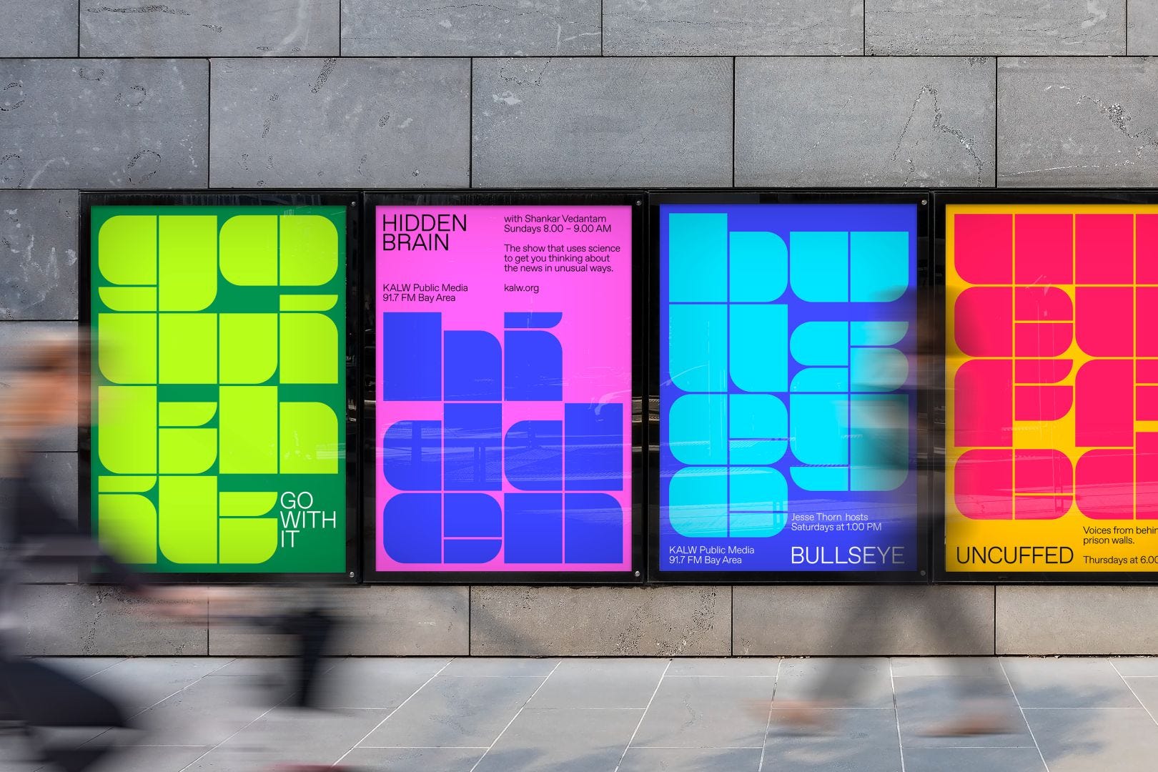
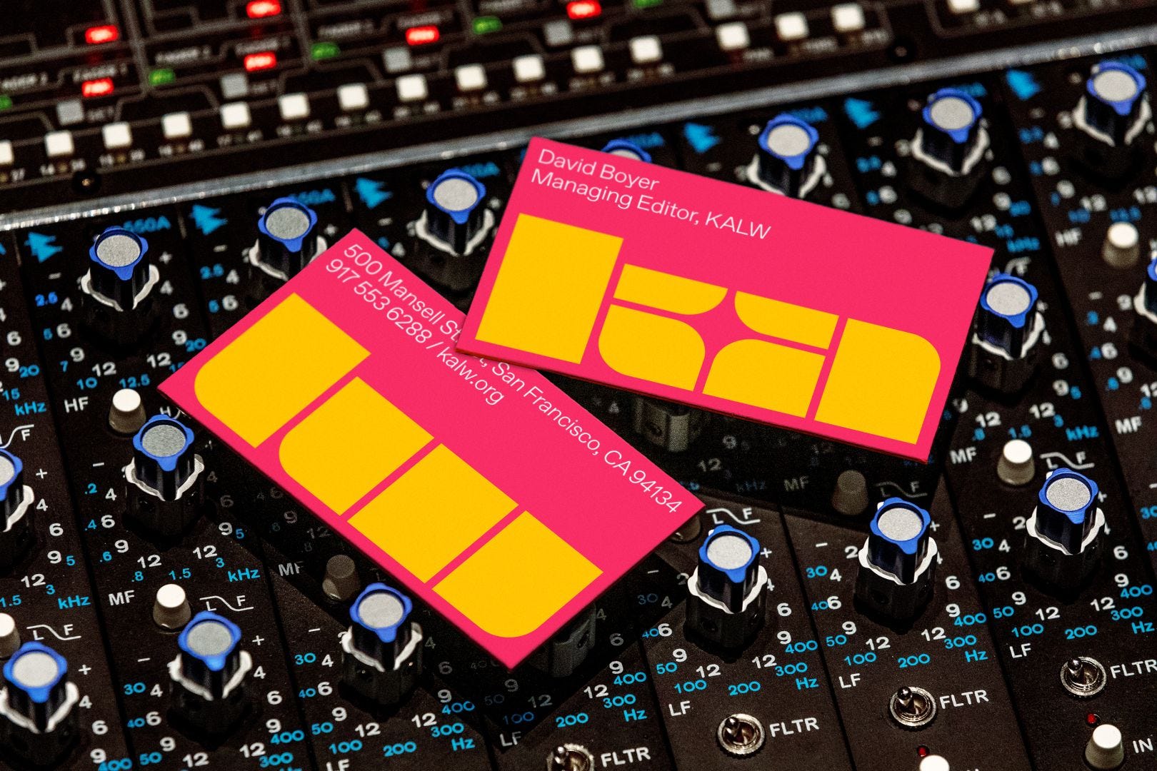
1. Collins rebrands a Bay Area Radio with great type!
You know how much I love bold and experimental type, so each time I see a good example of that kind of type, I cannot not sharing it with you :-) Here Collins did a fantastic job visually but also in the brief and process. Check out the blog post on Creative Boom.

2. Why is type inspired by '70s era candy so big right now?
In this article, Shaping Design explains why 70s funky, organic and bold type is coming back on the front scene right now. Really interesting take, and to me, this is again that kind of type is always used in a positive, colorful way to do marketing. Branding can be fun!


3. DynaPuff by Toshi Omagori
Google and the illustrator Jennifer Daniel worked with type designer Toshi Omagori to create a typeface that would be used in Android stickers. First, I like that kind of type for its design but also because it does use great Opentype features. To fully understand the design and use of Opentype, check out the blog post Google Design did about it.

4. Some great type videos for you!
If you want to know more about Opentype, I urge you to see that video Ulrike Rausch from Liebefonts did at Fronteers conference. It does explain in details how to create a font which does not look like a font :-)
And here is another video about a font made for people with disabilities and have difficulties to read clearly a text. The video is just like the one of Ulrike above, it is really easy to understand and can open your eyes on the possibilities but also the importance of good typography.
This is it for today, talk to you in the beginning of 2023 and I hope you get a relaxing break with family and friends. Take care.
Francis