


Want some inspiration, right?
After a few posts about mental health and difficulties as a creative, what about about getting inspired for new projects?

Hi everyone,
I hope you all had a good week. Here I think I worked 2/3hours all together. This is holidays time here in France for children. No school. So we planned many activities and my professional agenda was nearly empty.
You may have seen my reel on Instagram of me doing some stamping with stencils.
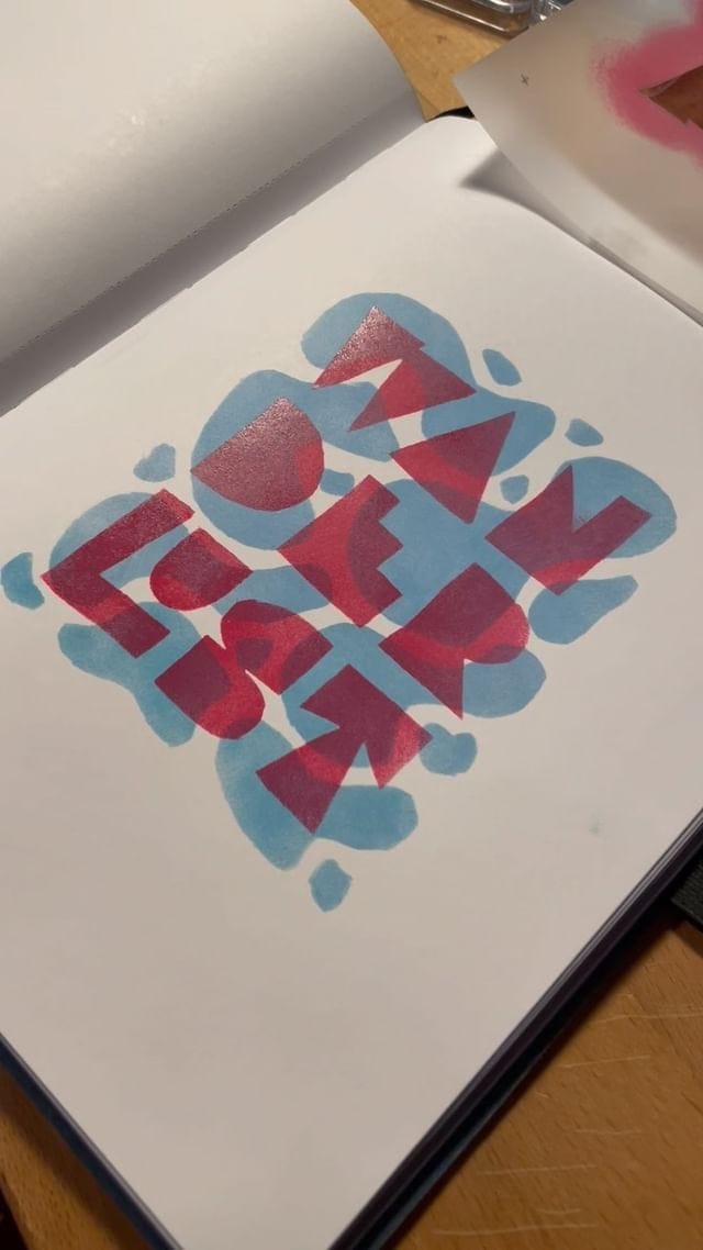
This is something I learned from Tom Haugomat’s Domestika course. And it works pretty well on my lettering. So I might do more of it in the coming weeks.
On tuesday, I publish a post for paid members where I discuss in details my actual difficulties to prioritize around fonts and lettering and asked members what I should do to get more visibility for my fonts. This is work in progress, but having that “team” really helps me to structure my orientations. If you want to join, here is the link:
Ok, this week newsletter will be about sharing with you some great links I discovered lately, I hope you will like them!
I can’t remember if I already talked about this Instagram account, but this is one of my favorites lately. Only lettering from the past, mostly from the 50/70s. It really inspires me and gives me ideas for new fonts. Interestingly not so much for lettering. But this is so good, so diverse, and so imperfect ;-) Go check it out!

I have been part of the club for some time now. $6 per month and you get a font each month. Some weeks ago I talked about reducing my costs. But there are still some things I pay for. Like supporting people who do great work. And David Jonathan Ross is part of them. I think this is important to support people like him because he does inspire me but mostly because we need people like him offering great fonts every month. He brings another model to our industry, and his fonts are mostly what we need in this world. Fonts that are slightly different, authentic, and sometimes really funky. And Megascope is one of them, with great Opentype features.

I am a big fan of Creative Boom website. I think this is my favourite website for all creativity. And if you did read my former posts about losing creativity, I think this post is a good complement. I won’t discuss it further here otherwise I can write for hours about the subject, but be sure that what you may feel right now is not your fault, this is a more and more common problem in our industries as the world changes quickly and we have to adapt. Take care of you all and don’t hesitate to share your thoughts in comments :)
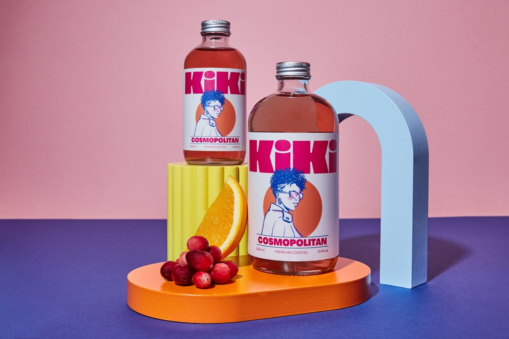
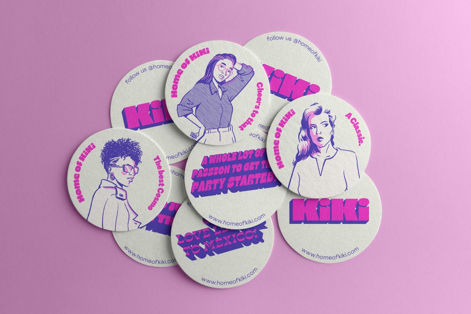
Another post from Creative Boom about the redesign of the brand Kiki. I really like how they used type, colors, and Art Direction in general to give such a powerful identity. You know my love for funky things and as usual I think we need more projects like this one. We need clients to take more risks for a more positive impact. Please read the whole post as the agency of charge of the project gives details about their process :)
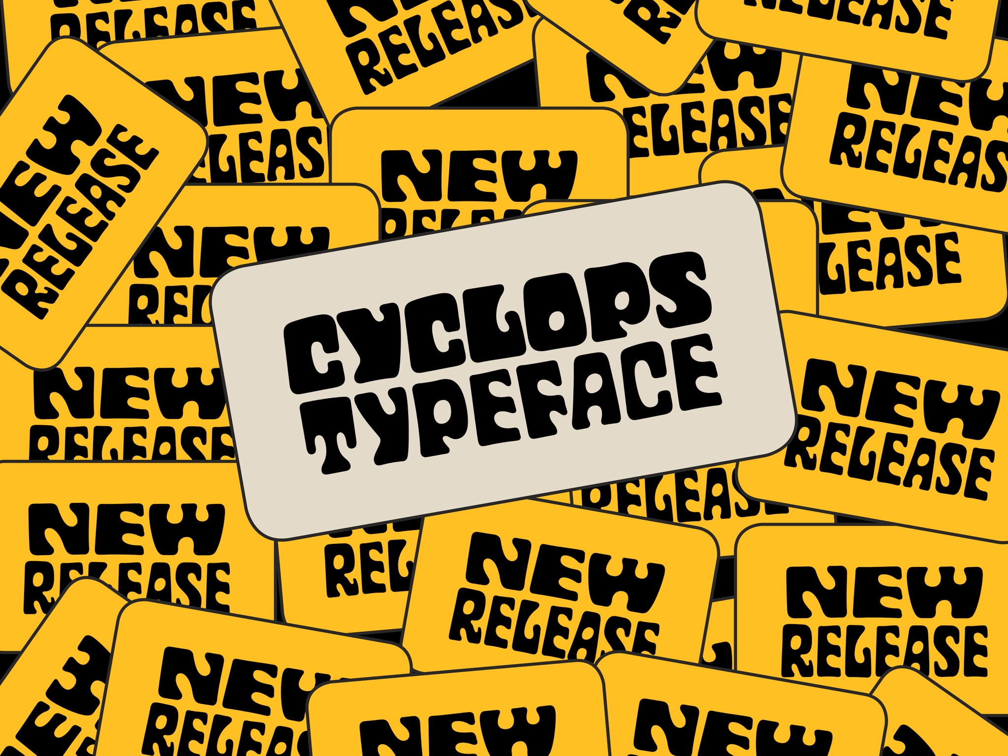
I think you won’t be surprised to see me sharing this font haha :D Imperfection is key!! I’ve always been a fan of Hannes von Dühren’s work. He started type design without any training/education in this subject and after few years creating simple display and funky fonts, he did develop Brandon Grotesque. BIM! And few years ago, he created the new typeface for Lufthansa. REBIM! But it seems he likes to create crazy things between serious fonts projects and I like that. So here is Cyclop! This is not easy for me to describe it. It is so unique and fun. Not sure where I would or could use it, but man, playing with it would be enough to me :D Go check it out!
This is it for this week! I tried to keep it short so every week you don’t have to spend one hour reading my post :P Enjoy your weekend, and if you want to support this publication, don’t forget you can become a paid subscriber at any time by following to button below.
Take care my friends and see you next week :)
Francis
I was about to send you the link of the Cyclops family just before I read your newsletter 😆