


#12 - New perspectives
Here is the November issue of the Typochondriac Newsletter! I hope you will enjoy it :-)

As some of you already know, my professional life changed drastically the last months. My wife took a new job that asks her to work and travel a lot. I then have to manage everything at home, plus kids, and I have a lot less time to work. So I decided to pause client projects and focus on passive revenues.
I chose to do that move. I actually did not want to continue on client projects, and do a break. So when my wife asked me if she should take that job, I gave her a big YES!
So as I said above I chose to focus on passive revenues. I already have some with my fonts, my book and my Domestika course. But I would like to do more.
More fonts…
During the last weeks, I worked on a new font, which should be out this month, I have a few others in the pipeline. I also try to develop more “sellable” fonts. Fonts that sell more. I don’t want to spend years to create a new Grotesque but offering something more useable first while staying in the Display world.
Prints…
I also want to create prints. I started to do some screen printing, riso printing and I bought a giclée A3+ printer. I found great paper and started to do some proofing. I am really happy so far. Some prints should be online before the end of the year.
A zine…
I love writing, I love taking pictures, I love Nature and hiking, and I love books. So it came quickly to my mind that I could do something that would mix all these passions. I started with the idea of a book but I discovered zines and fell in love. So my new project is to create a zine where I could write about hiking in the mountains next to my home (Vosges), publish photos, illustrations and lettering with it. The project is just an idea so far but when my new website will be online with the shop where I will sell my prints and fonts, I will have more time to focus on it.
A new website…
As part of that big project, I needed a new website. I have been on Squarespace for some years but found it difficult to sell digital products like fonts. Impossible to sell different licenses for one product and I wanted people being able to preview fonts before buying.
So I decided to move back to WordPress. I used Elementor to build the website and did put online a first version with my portfolio, blog, bio and contact form.
Next steps…
In the next weeks, I am going to create my shop with Woocommerce. I will have my fonts back online, and will create also the first prints. Of course, you will be the first to know and have a special discount for shopping on the website :-)
A chat to get closer to my subscribers. A good idea?
Substack, the platform I use to create my newsletter, just launched a new feature to be able to better/closer communicate with my subscribers. This is a chat room where I setup threads and we can talk together about inspiration, process and even exchange about your projects. I am not 100% sure yet if I want to do it. Would it be worth it? What do you think?
Depending on your answers I will send you a specific email to let you know how to join. If you don’t receive any email this week or next week, It will mean I did not launch that feature :-)
Let’s finish with a dose of inspiration?
This month I would like to introduce you to 2 artists and 2 projects.
Emma Bers
Emma brings something unique to lettering. We are here far far away from what I would call “trends” and she has a real unique vibe and identity. And that is why I think this is important for me to share her work here with you.


Dotto Studio
Dotto Studio is managed by Dani Molyneux, a great artist which also has a fantastic unique take on lettering. Even if the style is different from Emma Bers, Dani’s work has really something special which gives it a great identity. Dani offers many of her typographic illustrations as prints you can buy directly from her website.


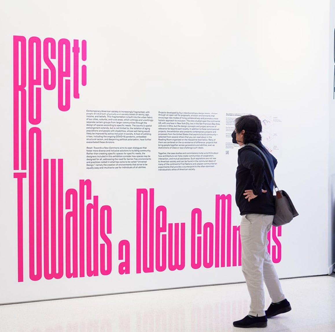
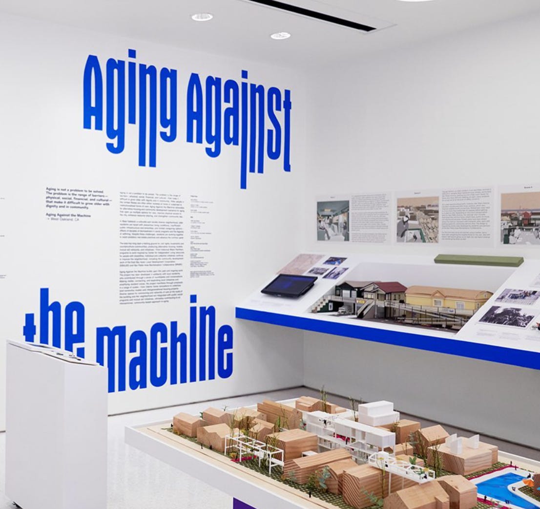
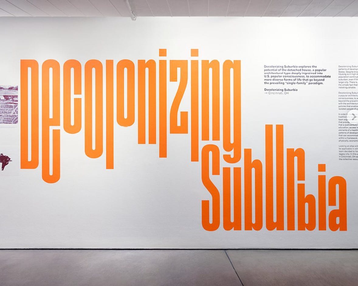
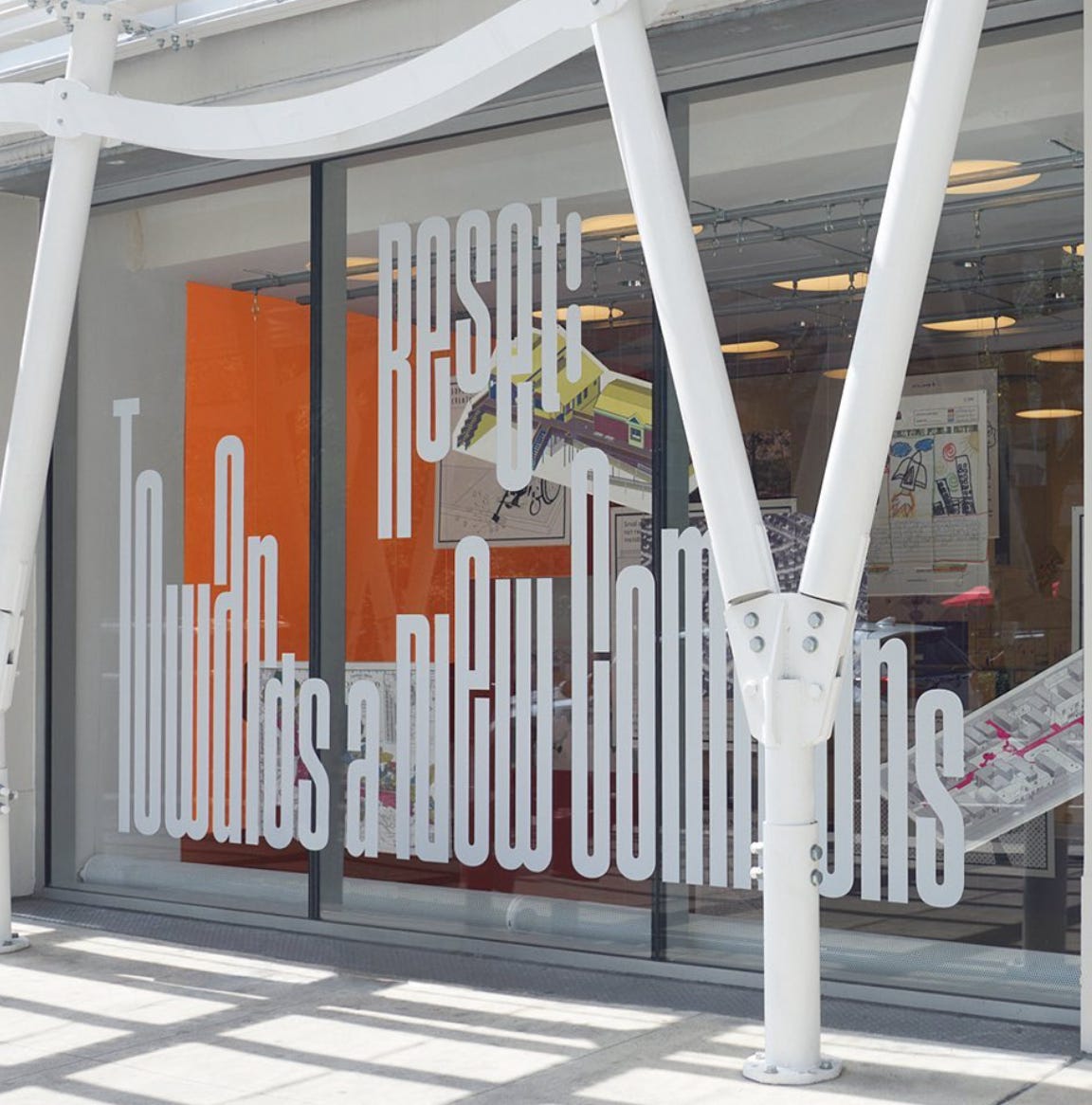
ICP project and Center for Architecture NYC, by Pentagram Design
2 projects for one agency. I am totally fan of these two, especially because they use condensed designs that remind me of my font Basalte (back on my website soon…). I love everything about their use of that kind of letters and when you design something “similar” you think your font could be used in WAY wider projects than you think. It is always amazing to see what people do with your work.
We need more of these kinds of projects that are strong in identities. They really bring unique view on a project with specific use of type. And I really think designers should sell way more projects of these styles. I have the chance to work in Switzerland, in a country where the use of type is huge. And it brings so much life to events and an open art gallery for the streets.
So here is the ICP project:


And here is the Center for Architecture NYC one:

That is all for today :-) I hope you enjoyed that mix of text and images. Don’t forget to answer the poll regarding to the chat, and if you are excited about the feature, I will send everyone an email to let you know how to join.
Enjoy falling leaves and Christmas market and talk to you soon :-)
Francis